Client
Rushmore Holdings
Industry
Business Services
Location
Dubai, UAE
Services Delivered
Iconic Metro Branding | Influencer Campaigns | Digital & Social Integration
The Challenge: Building a Brand with Weight and Intention
Rushmore Holdings operates across the complex and capital-intensive sectors of mining, infrastructure, and energy, delivering end-to-end solutions that span EPC (Engineering, Procurement, and Construction), consulting, and specialized equipment supply.
Their mandate was clear: they needed a brand identity that was equal parts robust and refined. The previous visual presence failed to communicate their immense capability and strategic vision. We were tasked with creating a unified brand persona that could command authority in global boardrooms while maintaining relevance on rugged worksites—a singular identity that could define their business, not just support it.
The Mosaic Digital Solution: Strategic Precision in Design
We approached this complex B2B branding project with a focus on conveying stability, precision, and forward momentum—the core pillars of Rushmore’s work.
The Visual Identity: Robust & Refined
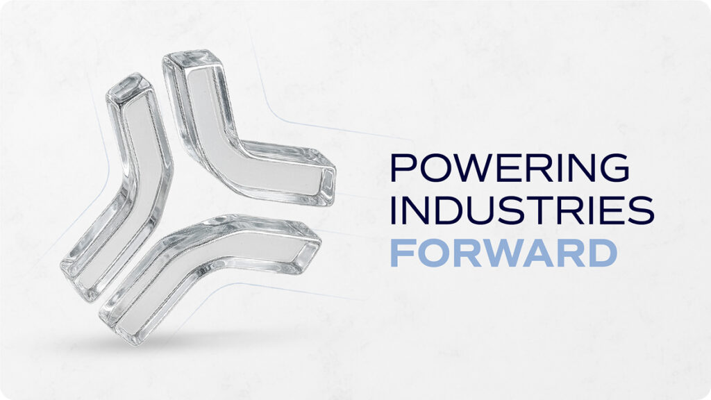
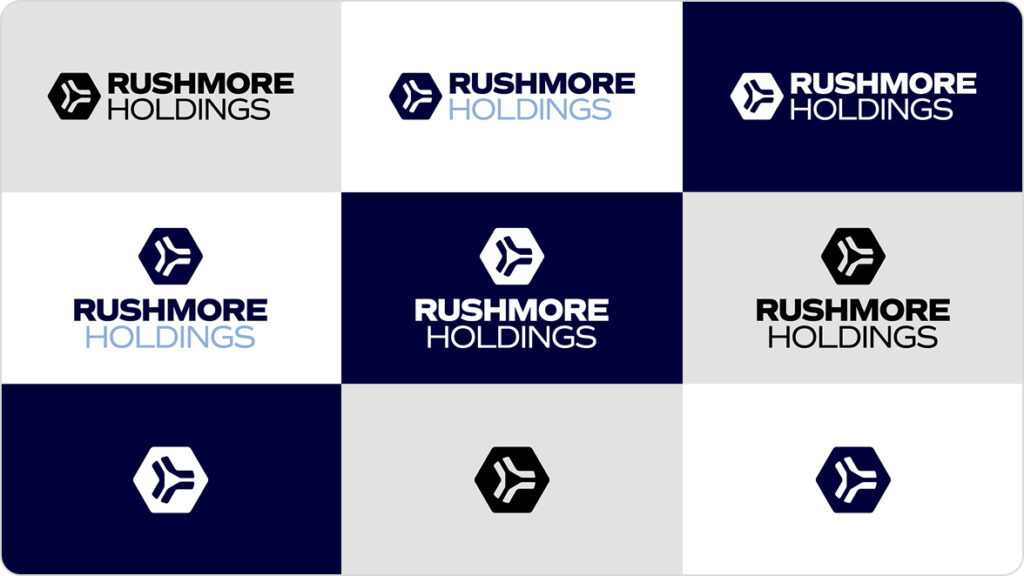
- Logo Development: We engineered the primary logo from the ground up, using strong, angular, and triangular forms. This geometric precision is a direct nod to the structural nature of infrastructure and construction, symbolizing unshakeable stability and strategic clarity.
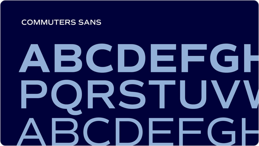
- Color Palette & Typography: We established a masculine, contemporary design language anchored by a grounded color palette. Bold, authoritative typography was chosen to reflect the scale and seriousness of their projects, while angular graphic elements echoed the sharp edges of machinery and geological formations.
Integrated Application (360° Identity)
The new identity was meticulously applied across all organizational touchpoints to ensure consistency and impact:
- Digital: Launched a clean, content-driven website designed to position Rushmore as an industry thought leader.
- Corporate: Developed high-end, professional corporate decks and investor presentations.
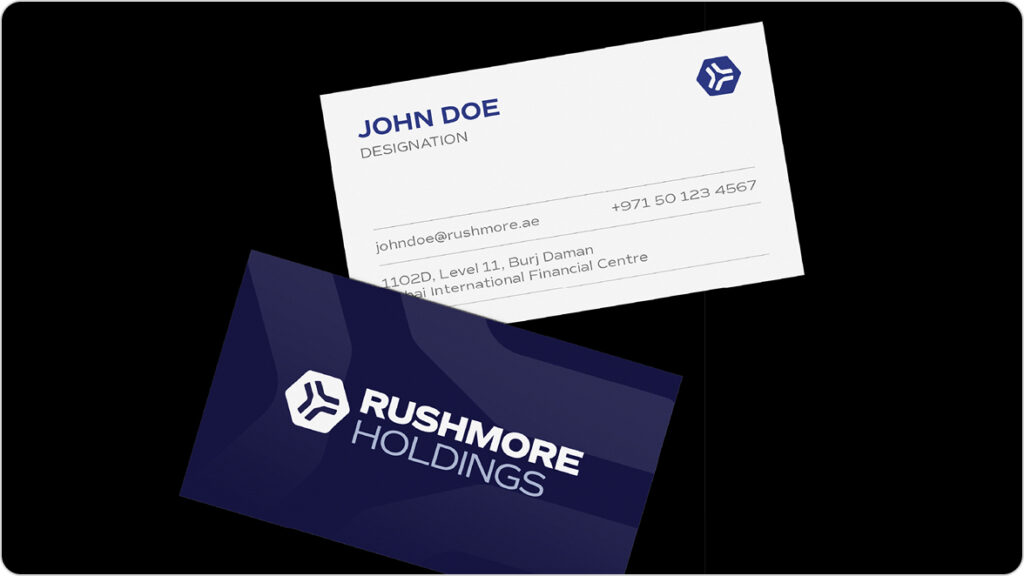
- Operational: Applied the branding to on-site signage, equipment, and professional uniforms, ensuring the brand communicated strength and capability in the field.
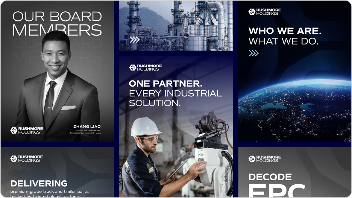
The Outcome: A Brand Built for the Future
Rushmore Holdings’ new identity is a powerful asset that defines their market presence and empowers their global ambitions.
The transformation moved the brand from fragmented to unified, from generic to authoritative. Now, whether they are presenting to investors or operating complex machinery in the field, the Rushmore brand speaks with one clear voice: Resilient, Strategic, and Built to Shape the Future of Industry.


